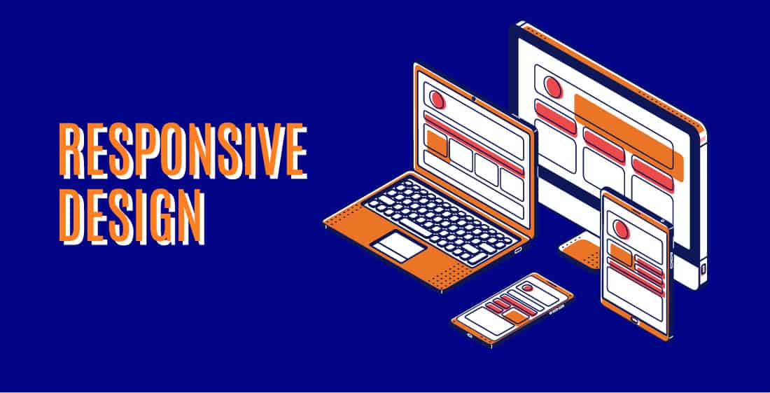
What is the big deal about responsive design and why do I need it in 2022?
Back in the 90s, while the internet was still the buzz of the town, it was a breezy ride for the developers. With small fixed screens and only two browsers to rule the web, the choices were minimal, making it easy as pie for the coders. Now, the world of tech is more diverse than ever, with mobile devices of various sizes and shapes. Today’s developers could even say that it’s a total tortuous mess.
Over the last decade, the worldwide web has been through multiple stages of evolution. And as it grew wider, it grew wilder. 21st-century web designing is exciting but also just as complicated.
What is Responsive Design?
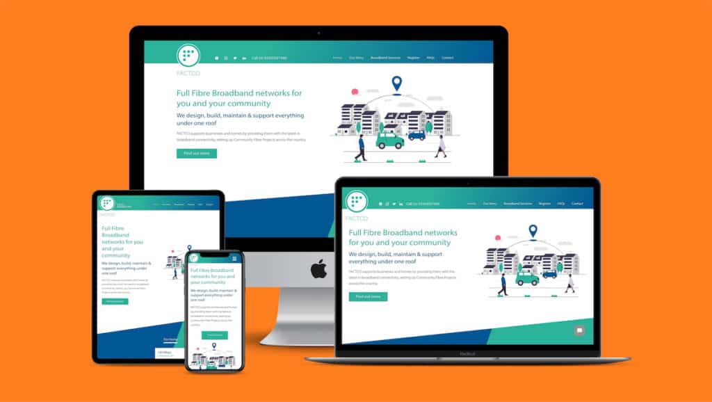
From basic, single-sized designs to responsive and adaptive websites, we’ve come a long way. Purchasing a new device these days can be more involved than one may imagine. You go to a store, and you’re flooded with options that boil down to a difference in inches. Devices are available in all sorts of sizes and forms. Responsive design was introduced to favour this and is used to create web content that adjusts seamlessly to various screen sizes and shapes.
The diversity amongst these products is impeccable. Currently, on my table itself, I can view the same website on my phone (6.5 inches), on my tablet (10.5 inches), or my laptop (16 inches). And if these websites weren’t adjusting accordingly, our browsing experience wouldn’t be the same.
A responsive website aims to render a smooth and efficient user experience, regardless of the size and shape. Needless to say, it is one of the most crucial aspects of web design today.
In more technical terms, responsive design uses HTML and CSS to auto-resize (shrink or enlarge) a website to complement all devices. For a website to thrive among millions of other successful ones, a developer must align the content, design, and performance to ensure user satisfaction and usability.
The ultimate goal is to save the user from taking the trouble of resizing, scrolling, and zooming to view your website and, in turn, offering an effortless viewing experience.
Why is the Hype around Responsive Design?
We live in a techno-diverse community. It is vital to ensure that your website conforms to this diversity and caters to as many devices as possible. Responsive website appeals to all device owners, regardless of shape and size.
As the stats grew more positive, in 2015, Google announced that designs that serve devices of all dimensions would become a determining factor in its search engine algorithms. With this update, a more mobile-friendly website would have higher visibility compared to the other.
How will it Benefit my Business?
Now that we have established that the world of web design is incomplete without the concept of responsive design let’s look at its value in growing businesses.
- A responsive design will, at the least, double your business’s visibility on the web. Allowing you and your brand to reach a broader audience on small and large devices.
- Establish a user-friendly platform that offers a seamless experience. And eventually aids in generating more views, sales, and conversions.
- Maintaining separate websites for users with different-sized devices can take a heavy toll on your pockets. With responsive design, you can invest in a single site and eliminate excess costs.
- A responsive website is flexible and efficient. Making changes will be much quicker and more straightforward as you do not have to do the same across multiple platforms.
- Beat the competition – according to a study conducted by Pure Oxygen Labs, two-thirds of the Fortune 100 and 44% of the Fortune 500 companies are not currently mobile-ready.
Furthermore, google’s official recommendation also suggests that using responsive design for smartphone-optimised sites has multiple advantages.
- Combining content for desktop and mobile under a single URL makes it easier for users to interact with the website. It also allows Google’s algorithms to assign appropriate properties to your page.
- Moreover, it enables Google to discover and retrieve your content more efficiently.
Fundamentals of Responsive Design
The fundamentals of responsive design boil down to three core principles:
Fluid Grid System: As we all know, anything fluid will continually flow to reform under applied stress. Similarly, as the name implies, fluid grids also flow naturally to fit the dimensions of the parent container, allowing it to adjust to various screen sizes and shapes. It’s commonly preferred to use CSS (Cascading Style Sheets) grid system for your website’s design base. With the grid system and generator, you will be able to assign the required properties and procure a single design that can expand or shrink as per the screen size.
Fluid Image Use: Unlike text, images are not fluid by default and hence, a little complicated for responsive design. This means they tend to occupy the same size and dimensions despite the viewport configurations and will even get cut off if the image is too large for the screen. This will result in inconsistent and shabby designs as your images will fail to adjust in proportion to the rest of the components. However, with CSS, you will be able to ensure that your images shrink or expand to fit the required screen sizes.
Media Queries: Media query is another popular CSS technique used in responsive web design as they enable you to create different layouts to match the different target viewports. The filter detects the device’s dimensions and alters your design appropriately. With CSS media query, you can accurately render your design to fit any device based on the height/width, orientation etc.
Best Practices for Responsive Design
Responsive design aims to achieve flexibility in every aspect of the webpage – text, image, layout, tables, etc. While there is a lot of freedom when designing your website using this approach, there are certain things that will ensure a quality end product:
- Mobile-first approach – Since shrinking designs have higher chances of causing cramping and havoc, it’s always easier to scale up your designs than to scale down to suit smaller screens.
- Minimalism is key – Minimalistic designs are not only easier to manage but are always in trend and also promote usability and efficiency.
- Think like a user – Your main aim should be to achieve an accessible and user-friendly website. Make use of the different fonts and styles to accomplish this. Also, ensure that all your texts and images follow the responsive design.
- Prioritise content – It’s essential to prioritise the content for your website. Useful and must-have information must be of primary priority. And remember, sometimes more is less. More content can be less appealing.
Generally, responsive design is the key to a successful website, but its easy-to-use nature can be misleading. If not used cautiously, it can be chaotic and demanding.
3 Outstanding Examples of Responsive Web Design
Over the last decade, responsive design has gained massive popularity and is now the key to launching a powerful and successful website.
Here are some great examples of responsive design that we come across on an everyday basis:
WIRED
Wired is an online American magazine platform that prioritises flexible use of content. They aim to serve accessible and navigable content for users across all devices. Their website boasts a dynamic design featuring several columns and articles on larger screens, which changes to a single column, displaying only the top stories on smaller/handheld devices
Wired’s use of fluid images is commendable. All their images are carefully curated with crop-on features that fit perfectly across all platforms.
In conclusion, Wired’s notable use of responsive design makes its platform much more powerful, and its usability makes it easier for users to read and share articles.
Slack
Slack is a business communication platform that thrives on simplicity and usability. It aims to accelerate communications within an organisation and improve efficiency. Hence, understandable why their designs follow the same theme.
The flexible grid layout allows seamlessly adaptation to a device of any size and shape. For example, on a bigger screen, Slack’s menu items are all displayed on a single plane, whereas on smaller screens such as tablets and phones, its menu options are grouped into a hamburger menu.
Github
GitHub is a repository hosting service used by over 65 million developers from around the world. And with the use of responsive design, GitHub ensures smooth navigation for all users and devices. Their website offers a consistent design across devices of all shapes and sizes.
For example, when switching from a PC to a handheld device, their homepage changes from a two-column design to a single-column layout, yet conveniently demonstrating all the crucial content.
Moreover, to simplify the design on smaller devices, they have removed the search bar and compiled the menu items under the hamburger icon. This is a prevalent practice with responsive design as it ensures that the platform is not congested or chaotic.
Pros and Cons of Responsive Web Design
Now that we have understood the significance and value of responsive design in today’s world, it’s also important to accept that, like every technological advancement, a responsive design also comes with its own pros and cons. And as a web developer, you must keep these in mind.
Pros
- Improved search engine ranking. Search engine algorithms rank sites higher in the search results if they work on mobile devices as well as desktop devices.
- Financially beneficial: With responsive design, you can eliminate the need to reprogram a separate mobile website. Frequent updation of content will now be a single-layered process.
- Trendy and modern: As technology advances, our websites must keep up too. Responsive sites look fresh and much more evolved as they are navigable on mobile devices too.
- Wider reach: You will be able to reach a larger audience on various devices as your site will now not only support different devices but offer a consistent experience across all of them.
- User-friendly: Responsive sites will eliminate the need to constantly zoom in and out to access links, buttons, texts, and images. This will improve user satisfaction and will likely encourage the user to spend more time on the website.
Cons
- Could curtail the user experience: Sometimes, responsive design will scale down components for mobile sites. So the experience might not be the same for users accessing the website on a handheld device.
- Vertical stacking: Website dynamics are changed to vertical viewing on mobile devices to accommodate smaller screens; this may result in overlooked information as users will restrain from long scrolling.
- Longer loading times: Many responsive sites are filled with images and content that needs to be resized to fit all screens. However, the rescaling could result in longer load times, creating a noticeable lag of 2-5 seconds.
The pros and cons of responsive design might be a good place to start when considering this approach for your business. There will always be a few drawbacks when adopting new technologies and innovations. But the key is to inspect the bigger picture and evaluate if it will be an asset or a liability for your business.
References
- https://techcrunch.com/2015/04/12/are-the-fortune-500-ready-for-mobile-search/
- https://www.interaction-design.org/literature/topics/responsive-design
- http://thenewcode.com/586/CSS-Fluid-Image-Techniques-for-Responsive-Site-Design#:~:text=Web%20page%20text%20is%20fluid,too%20large%20for%20their%20container.
- https://www.invisionapp.com/inside-design/examples-responsive-web-design/
- https://kinsta.com/blog/responsive-web-design/#how-to-make-your-website-responsive
- https://freshsparks.com/why-responsive-design-is-important/
- https://www.bopdesign.com/bop-blog/2013/10/the-pros-cons-of-responsive-web-design/
- https://brandongaille.com/20-pros-and-cons-of-responsive-web-design/
- https://www.smashingmagazine.com/2011/01/guidelines-for-responsive-web-design/
- https://www.w3schools.com/html/html_responsive.asp

